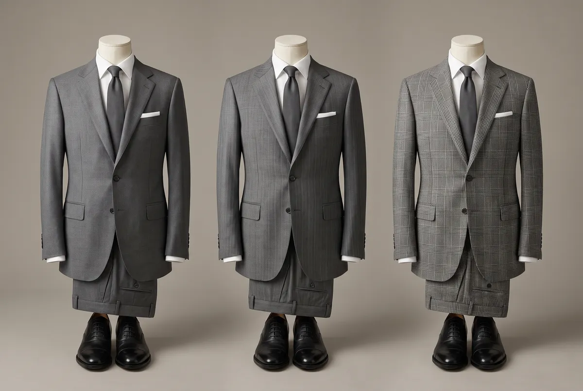
At the end of The Essence of Suit Colour: Why Three Are Enough, I wrote this: “a pattern rides on top of a colour and does not stand in for one”; “the first step is a stripe made from two depths of the same colour.” I made the promise without showing where it led. This article keeps it.
Plenty of men are drawn to a patterned suit and never quite step into one, held back by the same question, asked again and again over the years. Will this pattern look out of place in my industry, my rank, the room I am walking into? It is not a matter of taste, or of what flatters you — it calls for a judgement about how the people around you will read it. That, I think, is where pattern is harder than colour. Colour is a question of a plain surface; pattern adds a new kind of information to that surface — lines — and get the addition wrong, and the impression shifts in ways you did not intend.
This is written for men who put on a suit for work most days. Job-hunting, changing jobs, and the dress expected at weddings and funerals run on different criteria and are not taken up here. Nor is pattern chosen for women’s wear.
The order to follow, first. After plain, stripe. Once stripe feels natural, check. Why that order, I will explain as we go.
Will This Pattern Look Out of Place?
A dark grey striped suit, a gift from someone else — can it be worn to the office? What do you even call cloth with a faint vertical line running through it? Should check be avoided in a conservative industry? Questions about patterned suits keep coming, changing shape but never really going away.
What calls for judgement is not taste, or what flatters you. It is where to draw the line — how much of this pattern your industry, your rank, and the formality of the room will actually bear. The conventional wisdom stops well short of that line: stripe reads as forceful, and with check, the smaller the pattern the safer it is. Advice on dressing by age and career stage is a well-covered subject, and most of it centres on colour, silhouette, and price range; the line drawn specifically around pattern, as far as I have found, gets little attention.
“Flattering” or not, in the usual sense, is settled by build and features. Industry, rank, and occasion are a different axis entirely — not a matter of fit with your body, but of balance with your standing. The same pattern reads differently depending on the position of the man wearing it. This article keeps its aim on that axis: balance.
Pattern Continues Where Colour Leaves Off
Start with how pattern relates to colour. Pattern is not a substitute for colour; it sits on top of it. Add a stripe to a navy suit and the work that navy is doing — setting how you want to be received — does not change. I set out that work in The Essence of Suit Colour: Why Three Are Enough. What pattern changes is how much is added on top of that colour.
There are stages to how much you add. First, a stripe made from nothing more than two depths of the same colour. Then a check, where lines running in different directions cross one another. The first keeps the colour itself intact and only adds expression; the second, through the crossing of lines, adds a second kind of information distinct from colour altogether. This difference in stage is the direct answer to why you should start with stripe.
Some men jump straight from plain to check. To my mind, that is the same haste as reaching for a fourth suit before the basic three are in place. Skip the stages and start with a pattern that speaks loudly, and you may learn how it suits you — but you still lack the judgement to know how the room will read it. With pattern too, working up from the quietest kind is what trains the eye that has to choose.
Why Stripe Comes First
Stripe and check look fundamentally different from a distance. I put this down to the number of directions the lines run in.
Stripe runs in one direction only. As distance increases, the gaps between parallel lines fill in visually and merge into a single surface. What reads as lines up close becomes, at a few metres, something close to a plain surface.
Check, on the other hand, has lines crossing in two directions. Where they cross, a patch reads darker than the rest, and that patch of contrast survives even at a distance. So check keeps announcing itself as a pattern for far longer than stripe does. How loudly a pattern speaks, in my view, comes down to how many directions its lines run in.
If you are starting from the quietest end, stripe is the one that makes sense. It keeps nearly all the composure of plain cloth, and hands over its expression only to whoever is standing close enough to see it.
The Shadow Stripe: A Suit No One Notices Is Patterned

Of all the stripes, the one I would place first is the cloth known as a shadow stripe. Rather than mixing threads of different colours to build the stripe, it changes how threads of the same colour are woven, and raises the vertical line from nothing more than a slight difference in how light reflects off it. The dye stays a single colour throughout; the pattern is made entirely by the shading of the weave.
From a distance it reads as close to plain; only up close does the stripe register at all. That very difficulty of noticing is exactly why it suits a first patterned suit. It does not reach the other person across a meeting-room table. It does not reach at the distance of a handshake either — it only carries as far as the seat beside you. Placing this one suit ahead of check, rather than jumping straight from plain to check, is, as I see it, the easier way to build a feel for choosing pattern.
What I find interesting is that it functions as plain from a distance while still delivering, to whoever sits close to you, the laboured information of a woven shadow. The stripe is noticed only after the handshake, once you are both seated. That order of noticing is, among patterns, as restrained as it gets — there is no real way to get it wrong.
Pin Stripe and Chalk Stripe: The Next Stage
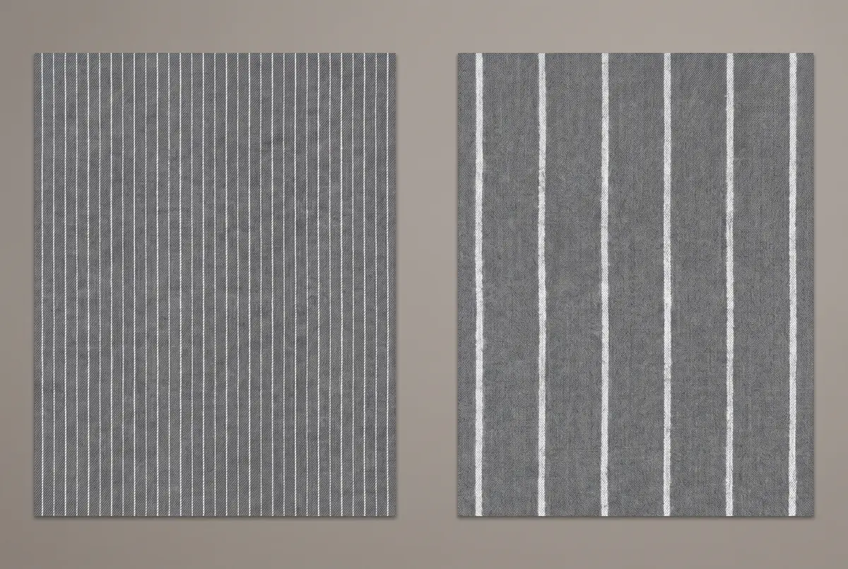
Stripe carries a second axis, separate from the number of directions its lines run in: the thickness of the line itself, and the spacing between lines — the pitch. This is a different axis from the one just discussed. I would rather not let the two get confused.
The fine-lined stripe known as pin stripe is the next stage after shadow stripe. The line is clearly visible, but the spacing is narrow. From a distance it still reads as close to plain, and only up close does the fineness of the line come through. That way of being seen tends, I find, towards an impression of precision and restraint.
The wider the line and the broader the spacing, the more the impression changes. The stripe known as chalk stripe — a thick line that looks drawn on with chalk — is the clearest case. The outline of the line itself is bold enough to read as a pattern even from a distance. It leans, I find, towards a louder, more assertive impression.
Even within the single category of stripe, thickness and spacing alone create this much range. As a rough guide: in industries such as finance or law, where restraint is generally favoured, start with a fine, narrow stripe; in fields with more room, such as the creative industries, the range can widen to include a thicker stripe. It is not a world uniform enough to state as a rule, so treat this only as a guide.
If the number of directions decides the type of pattern, then thickness and pitch, as I see it, decide how loudly a given type speaks. Even within the same category of stripe, these two carry a clear difference in volume. Choose chalk stripe for a first suit and you risk being read with more force than you intended — better to keep it for later in the order.
After Stripe, Move to Check
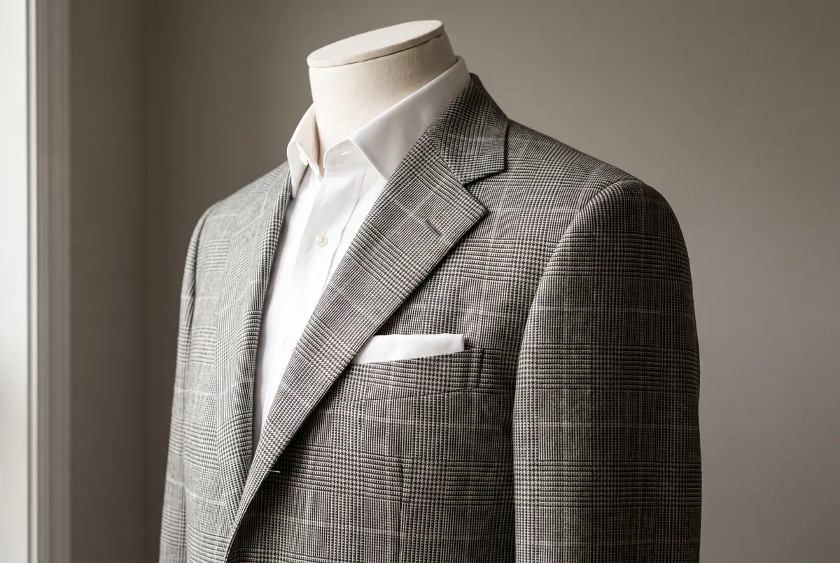
Once stripe feels natural, check is the next step. The reason is the one already given: with lines crossing in two directions, check is the louder pattern — the one that keeps reading as pattern from farther away than stripe does.
Worth separating out here: how loudly a pattern speaks and how casual it looks are two different axes. Check is louder in the sense that it carries as a pattern from farther away than stripe does, but louder does not automatically mean unfit for business. Check sits one visible step away from the tidy lineage that plain and stripe belong to, and that step, I find, tends to pull it towards a more relaxed impression. Loudness is a question of how far it carries; casualness is a question of how relaxed it looks. Keep the two apart and your judgement on check stays steady.
The check worth learning first is the pattern known as glen check (also called Prince of Wales check). It combines a fine check with a larger one, so that from a distance it reads as a restrained woven texture, while up close the structure of the check becomes legible. Among the many kinds of check, I would put it towards the settled, easier-to-wear end.
Beyond glen check, there are many other kinds — a fine check tiled tightly across the cloth, a bold window-pane pattern, and more. But for a first suit, I would rather get comfortable with check as a stage than range across its varieties. Whether you can carry over the sense you built with stripe — an awareness of the distance at which something gets noticed — and apply it to check as well is, I think, what shows how deep your understanding actually goes.
How Loud a Pattern Should Be Depends on Your Standing
Taken together, this settles into a single answer. There is no restriction by age or rank on whether you may wear a patterned suit. What needs adjusting is how loudly the pattern speaks.
A loud pattern, I believe, is read the way you intend only when it is in balance with the wearer’s own record and standing. People take the measure — without quite meaning to — of whether the loudness of what a man is wearing matches the record he is actually bringing into the room. Choose a loud pattern too early in your career and the clothing gets ahead of you, which can read as imbalance rather than confidence. That is exactly why starting with a quiet stripe while your experience is still thin, and widening your choices as your standing rises, is the way to move through this without strain.
Plenty already exists on choosing a suit by age, built around colour, the standing of the cloth, and price range. But as far as I have found, nothing draws the line on age or rank specifically through how loud a pattern is. This shares an axis with what I wrote in The Essence of the Double-Breasted Suit: Why the Measurements Decide Who It Suits — that suitability there is decided by neither age nor rank. That article’s focus, though, was cloth and fit. With pattern, what matters is the balance. How loud it speaks must match the wearer’s own record and standing. Pattern has its own reason, distinct from the double-breasted’s.
Pairing With a Tie: Don’t Let the Patterns Align

Once a man has settled on a patterned suit, the next question is almost always the tie. There is one principle worth holding onto here as well. Do not stack a stripe of the same direction and the same spacing on top of another.
Pair a striped suit with a striped tie. The two sets of lines end up sitting close together. The boundary between them turns busy. What to avoid is not pattern itself but the direction and spacing of two patterns landing too close to one another. A plain tie sits comfortably against a striped suit without conflict. A pattern built from dots rather than lines — a foulard or a polka dot — pairs well too. Choosing a different kind of pattern keeps the chest looking composed.
There is also a way of pairing that deliberately keeps the pitch — the spacing between lines — different. Layer a fine-pitch stripe over a wide-pitch stripe and, I believe, you avoid monotony and gain some depth. This, though, is a refinement built on the basics, and not something I would recommend as a first step.
Beyond the tie on its own, it is worth stepping back to look at the three pieces together — suit, shirt, and tie. Once two or more of the three carry a pattern, the difficulty of pulling it together rises sharply. Keep one of the three plain, I believe, and you are unlikely to go far wrong.
A plain white shirt is close to conflict-proof against a patterned suit. How to choose a white shirt is set out in The Essence of the Shirt: Why the Collar Decides Your First Impression, but on a day you are wearing a patterned suit, there is no real need to add pattern through the shirt as well. Confine where the patterns can collide to a single point, and the overall impression stays uncluttered.
In Closing: Learn Pattern By Its Order
With a patterned suit, learning the order is quicker than learning the varieties. After plain comes stripe, made from nothing more than two depths of a single colour. Start within that with a hard-to-notice piece like the shadow stripe, and build familiarity as you move up in thickness and spacing. Once stripe feels natural, move on to check, where lines cross in two directions.
There is no restriction by age or rank on whether you may wear pattern. What changes is how loudly a given pattern speaks, and whether that volume is in balance with your own record and standing.
The confidence you wear wins the game.
Frequently Asked Questions
It is not the pattern itself that looks out of place, but a mismatch between how loudly it speaks and the room you are in. A stripe made from two depths of the same colour — the shadow stripe above all — speaks the most quietly of any pattern, and can be worn with much the feel of plain cloth. Check speaks louder, so it is safer to save it until stripe feels natural.
There is no age restriction on wearing pattern. How loudly it speaks, though, is read against the wearer’s own record and standing, as I see it. Starting with a quiet stripe while your experience is still thin, and widening your choices as your standing rises, is the way to move through this without strain.
Start with stripe. How loudly a pattern speaks is decided by how many directions its lines run in: stripe, running in one direction, reads as close to plain from a distance, while check, with lines crossing in two directions, keeps reading as pattern even from far away. Within stripe itself, a fine line with narrow spacing is quieter, and a thick line with wide spacing speaks louder.
It is safer to avoid it. Stack a stripe of the same direction and spacing on top of another and the boundary turns busy. Pair a patterned suit with a plain tie, or with a different kind of pattern such as a foulard or a polka dot, and the impression at the chest stays composed.