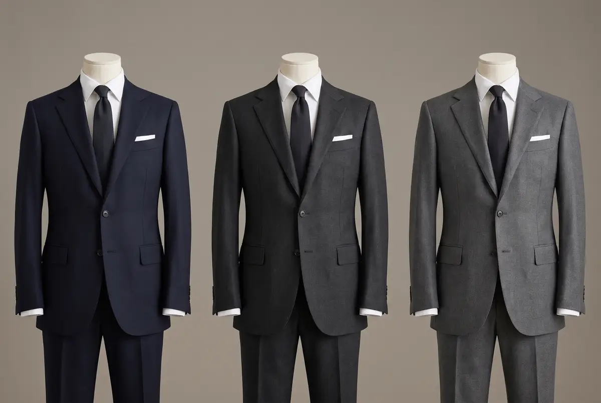
When a man adds a suit to his wardrobe, colour is the last thing he settles. There are criteria for cut and there are criteria for cloth. For colour there are none. Add one garment at a time on that basis and you end up with two navy suits and a scattering of odd ones that belong to no scheme at all.
The answer first. Dark navy, charcoal grey, medium grey. Three suits in those colours will carry a business year. A fourth colour can wait until a need for it appears.
Why three? The reason does not sit with the colours. It sits with the person you are about to meet.
This is written for men who wear a suit to meet people as a matter of course. Graduate recruitment and job interviews run on different assumptions and are not taken up in this article. Nor is ceremonial dress, which is decided along another line of reasoning — though how the colour black is read in business is dealt with below.
Colour Reaches the Other Person First
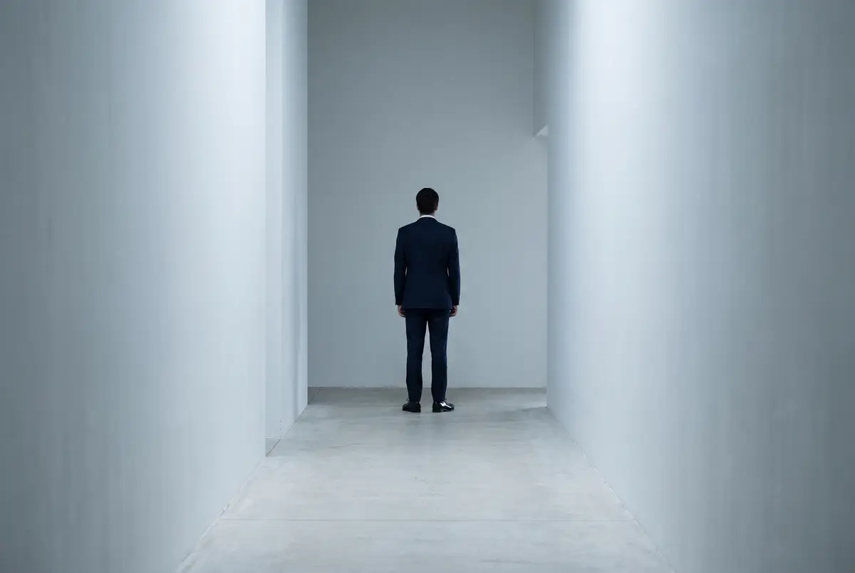
You walk into a meeting room. Someone turns at the far end of a corridor. A lift door opens.
What has reached the other person at that moment is not your face, nor your tie, nor your shoes. At that distance the detail has not resolved. What has arrived is the colour of the largest surface you present, shoulder to hem — the dominant colour of you at that moment.
The reason is nothing more than area and distance. A suit occupies the widest surface on a man. A face is a fraction of it; a tie smaller again. The further away the viewer, the sooner the small things drop out, and what survives longest is the largest surface — the colour of the suit.
So colour arrives before you have said your name. In the piece on the double-breasted suit I wrote that dress speaks before words do. That was about dress as a whole; colour is the part of it that lands first.
Which fixes the order of the decision. Do not go looking for the colour that suits you. Work backwards from the person you are meeting. Who is it, and what do you want them to take from the encounter? Answer that and the colour follows.
Three Is Enough Because Colour Sets Only the Distance Between You
Why should three be sufficient? Because colour, reduced to its essentials, does only one job. It sets the distance you keep from the other person. That is all.
Let me be clear about what coming forward is for. It is not to push the other person over. It is to put your own side in the shape they can most easily receive. Judging that distance is itself an act of courtesy. The higher the stakes, the more carefully it deserves to be done.
There are days to come half a step forward. There are days to give the room away. There are days when you want the other side to unclench. What a man is measuring in business is that distance, and it comes in three.
And distance can be dressed at three settings, no more. With two, the day you give the room away and the day you want the other side to unclench become the same suit. Go to four and you can no longer explain the difference between neighbouring settings even to yourself, and your hand ends up reaching for the same two or three anyway. Three distances, three colours.
Each colour takes one distance. Navy carries a hue and offers trust. Charcoal grey removes the hue and yields the room. Medium grey lifts the lightness and lowers the tension. Only two variables are moving — hue and lightness — and nothing beyond them is added. That is why three garments are enough.
The First: Dark Navy, the Colour That Goes Anywhere
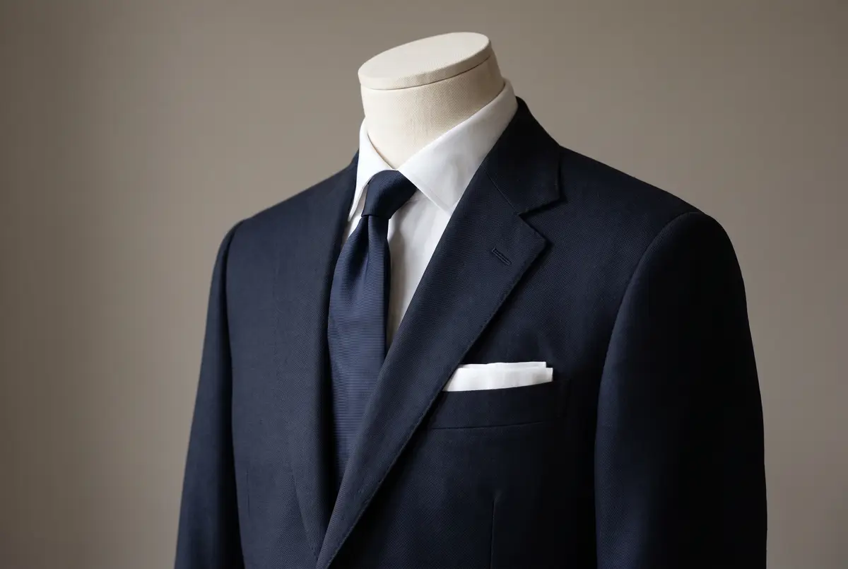
The first suit is navy. In the double-breasted piece I put plain navy first as well, and for the same reason. Not because it is the default, but because few colours satisfy three conditions at once.
First, its lightness is low. Dark colours draw in the line of the body. At the same build, a man reads as trimmer in a dark suit than a light one.
Second, it is not as dark as black. A face carries the colour of blood and is light. Put true black directly beneath it and the gap grows too wide, and the face is the thing that sinks. Navy holds its darkness without opening that gap so far.
Third, blue sits opposite the hue of skin. Skin varies enormously in depth between individuals and between populations, but in hue it lands in the same region everywhere in the world: towards orange. Blood and the pigment in the skin settle that between them. Arrange the hues around a circle — the colour wheel — and orange faces blue across it. Colours that face one another in that way are called opposite, or complementary.
Two colours set near one another have their difference reinforced to the eye. The Japanese Industrial Standard JIS Z 8105:2022 (Glossary of colour terms) defines this at entry 3046 as colour contrast, and, where the two are seen side by side at the same moment, at entry 3047 as simultaneous contrast. That a face reads better above navy owes a good deal to it, as I see it. And because skin sits towards orange the world over, navy is not a colour that happens to suit one complexion and not another.
There is also personal colour analysis, which works out the colours that suit an individual from skin, hair and eyes. As an instrument for dressing with pleasure it has its uses. For the business suit, though, I would stay inside these three colours and tune within them. Search widely for the shade that flatters you and you accumulate garments with narrow uses. There is range inside navy in how much blue it carries, and range inside grey in how light it goes. What you are choosing is not the colour, but where you sit within each of the three.
Darkness draws in the line, the face keeps its colour, and the contrast lifts it. That is why navy goes anywhere. A first introduction, a negotiation, a meeting outside your own firm — it does not miss. On a day you cannot decide, this is the one to reach for.
Choose it dark, choose it plain, and keep the sheen down. Drift towards a brighter blue and the garment reads as brisk rather than sound. Cloth with a sheen adds a brightness you did not intend under artificial light. How to read cloth belongs to the piece on material, but the first suit is where the budget should be weighted. It goes out most often and stays longest in front of other people.
For my own part, on days when I am meeting someone for the first time and the matter at hand is heavy, I still take navy. The reasoning is close to elimination. There is nothing I want the clothes to add that day. Navy is one of the few colours that says nothing whatever about the man inside it.
The Second: Charcoal Grey, the Colour That Yields the Room
The second suit is a dark grey — charcoal, the colour of burnt wood.
What separates it from navy is that it carries no hue. Grey is achromatic. A colour that carries a hue is read as a statement in itself; where no statement is wanted, the colour that makes none works faster. In an achromatic suit the eye travels upward, to the face and to what comes out of it.
That property earns its keep where you are not the principal. A meeting you have been invited into at another company. A table where people senior to you are seated. A hearing, or a review of your work. Lead with the sincerity of navy in such rooms and it can read as pressing forward. Charcoal takes that step back for you.
For depth, take it as dark as it can go while still not being mistaken for black at a distance. Darker than that and you enter black’s territory, and you inherit the problem of complexion described below.
The Third: Medium Grey, the Colour That Closes Distance
The third is a grey of middling lightness.
As lightness rises, the gap against the face narrows. A narrower gap means less visual tension. Put plainly, the hardness comes off.
Use it where you want the distance closed. Inside your own company. A client you already know well. A meeting that runs half a day or longer. A conversation in which you do not want the other person braced. Navy and charcoal through a whole day can leave a room tighter than it needs to be, and easing that is this suit’s work.
The condition is not to take the lightness too far. Go up to a light grey and the line of the body slackens instead. The middle, where firmness and softness balance, is why it is a medium grey.
With those three in the wardrobe, the days that need tightening, the days that need standing back and the days that need easing are all within reach.
Why Black Is Not One of the Three
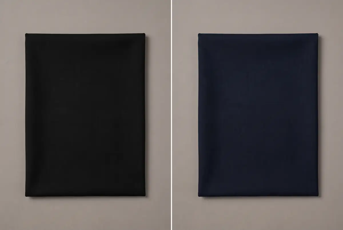
You may have noticed that black has not appeared once. In Japan it is sold as one of the staple suit colours, and it is worn widely.
I still do not put black among the three. There are two reasons. One holds wherever you are; the other is specific to Japan, and worth knowing if you deal with Japanese counterparts.
Black Takes the Colour Out of a Face
The first reason is plain. Black has the lowest lightness of any colour.
As set out above, the darker the colour beneath a face, the wider the gap against it. Black opens that gap to its maximum. Open it too far and the face is what goes dark and sinks.
The difference shows most where several people stand together. Put a number of faces under the same lighting and a basis for comparison exists; a difference nobody would notice in a one-to-one meeting becomes visible the moment the line forms.
In Japan, the Black Suit Sold as Ceremonial Dress Dates from 1947
The second reason applies in Japan, and it is worth setting out because the reading is not obvious from outside.
Western dress entered Japanese officialdom by decree: Dajōkan Proclamation No. 339 of Meiji 5 (1872) established full and ordinary court dress for civil officials. Japanese formal dress in the Western manner begins there.
The plain black suit sold in Japanese stores today as reifuku — ceremonial dress — does not descend from that line. It was made after the Second World War. According to the corporate history of WATAKI Inc. (Kindware Co., Ltd. until 2024), the firm devised a double-breasted ryakureifuku in 1947 — the Japanese category of plain black dress worn to ceremonies, which does not correspond to Western semi-formal wear. It was a garment for a period when few could afford new clothes, cut so that a soiled shirt was hidden and so that a man could put it on with something of the feel of a kimono.
The dress historian Kaori Nakano has written that this black ryakureifuku spread on the strength of a single garment serving two duties — a black tie for mourning, a white one for a wedding — and that it took shape in Japan separately from the development of Western formal wear (Kaori Nakano, “Nihon no reifuku wa sengo umare: jitsu wa sekai de tsūyō shimasen” [Japan’s formal wear was born after the war, and does not in fact travel], THE NIKKEI MAGAZINE, 12 October 2017). The way it is sold — one suit covering both funeral and wedding — has not changed. The plain black suits on the formal rail in a Japanese store are the continuation of that idea.
That said, black is read as ceremonial in Japan not because of its history but because of how it is used now. The same colour, in very nearly the same cut, turns up at funerals and at weddings. The association is already fixed in the mind of the person looking at you.
So what happens when a man wears plain black to a weekday meeting in Tokyo? The other person sees the colour and hesitates for an instant over whether to read it as business dress or as ceremonial dress. Information you did not intend has been added. Colour is the thing that arrives first, and that hesitation is placed at the entrance to the conversation.
If you never deal with Japanese counterparts, none of this second reason applies to you — but the first one still does, and on its own it is enough to leave black out of the working three.
None of which means black is unnecessary. Keep one plain black suit for the occasions that call for it — a funeral above all — and use it for those. It simply does not count among the weekday three.
Where Brown, Beige and Light Grey Belong
Can light grey or brown be worn to work? The places where they work and the places where they do not divide sharply.
Brown changes its expression readily under different light. The same suit is warm in daylight out of doors and goes muddy under fluorescent tubes. What it means shifts with the room. That rules it out where you need the reading fixed — a first meeting, a negotiation that matters. Turn it the other way and the same variability becomes richness, in weekend dress and in a jacket worn on its own.
Beige is high in lightness and the line of the body slackens. It works at a summer resort or in genuinely relaxed company, but it does not belong at the centre of business. For the summer suit, see the piece on linen.
Light grey earns its place outdoors in summer and when speaking in front of a large room. The further away the viewer, the more a dark colour reads as a single mass while a light one keeps its modelling legible. Up close it gives up firmness. Going into winter, a cloth of the same lightness with a raised finish — flannel — settles the question of season.
All of these belong to the fourth suit and beyond. Add them once the three are in place and a need has appeared. Reverse the order and the narrow garments arrive first, and hang unworn.
Shirt, Tie, and Then Pattern
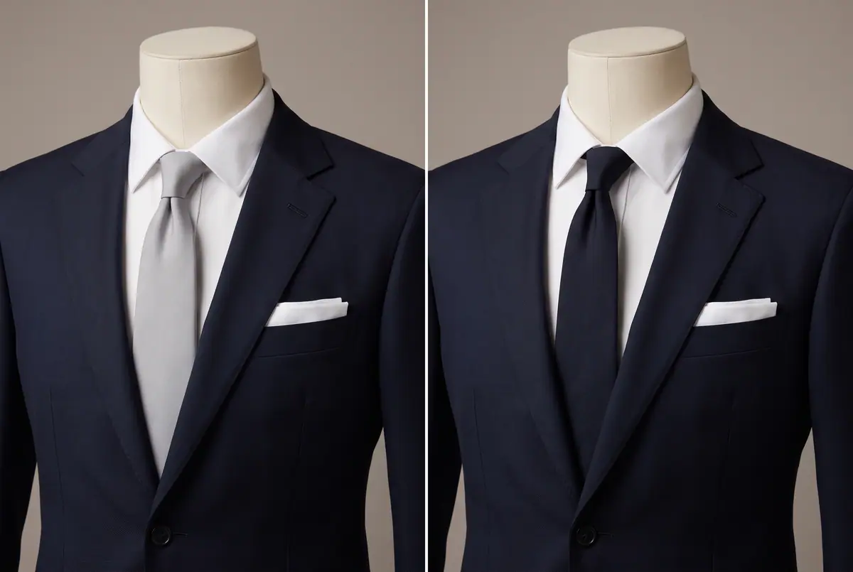
The commonest question about colour is not about the suit on its own. It is about the combination, shirt and tie included.
Everything turns on getting the order right. Decide the suit, then the shirt, then the tie. That is the order of area, and it is also the order in which the three reach the other person.
Begin the shirt at white. It goes with all three suits and puts a light surface directly under the face, lifting the expression. The reasons and the choosing are set out in the piece on the white shirt. A pale blue is particularly at home with navy: the same hue in two depths, stacked vertically, holds together.
Take the tie clearly darker than the suit, or clearly lighter. It is the middling near-match that goes soft. Where the difference is small, the boundary disappears at a distance and the chest reads as one flat plane. With dark navy: burgundy, a deep blue, a dark grey. One red-toned tie, kept within the bounds of sincerity, softens the opening of a conversation. Charcoal grey takes blue — a single point of colour on an achromatic suit, so the tie’s colour becomes the impression. Medium grey takes dark colours generally; the suit is light, so the tie does the tightening.
At the foot, a black Oxford with closed lacing, polished without glare, carries all three. Brown shoes go with navy and with medium grey, but return to black where standing is required.
Pattern comes at the very end of that order. While you are assembling the three, keep them all plain. Plain cloth does not choose its occasion; and beyond that, a pattern rides on top of a colour and does not stand in for one. Add pattern early and you lose the ability to distinguish within a single colour. Once you are adding a second suit in a colour you already own, that is the moment for pattern. The first step is a stripe made from two depths of the same colour — woven in, rising only as the light catches it. Close to, it reads as a pattern; at a distance, as plain cloth. The usefulness of plain is kept, and only the expression is added. What comes after that belongs to The Essence of Suit Pattern.
In Closing: Three Suits Carry the Year
The colour of a suit is not chosen by whether it suits you. It occupies the largest surface and reaches the other person first, so it is chosen by working backwards from the person you are meeting.
What colour adjusts is one thing only: the distance you keep. Three distances are all that can be dressed, so three colours are all you need. Dark navy on the day you come half a step forward, charcoal grey on the day you yield the room, medium grey on the day you want the other side to unclench. Judging that distance is itself a courtesy to the person in front of you.
Keep plain black for formal wear and leave it out of the weekday count — it opens the widest gap against the face, and in Japan it carries a ceremonial reading besides. Brown, beige and light grey can be added once the three are standing and a need has appeared.
Age has nothing to do with assembling them. A salesman in his twenties and a board member are doing the same single thing: working backwards from tomorrow’s counterpart. What changes is the person you are meeting, not the way you choose.
The confidence you wear wins the game.
Frequently Asked Questions
Three is the working number: one dark navy, one charcoal grey, one medium grey. Colour adjusts a single thing — the distance you keep from the other person — and that can be dressed at three settings, no more. With two, the day you give the room away and the day you want the other side to unclench become the same suit; with four you can no longer explain the difference between neighbouring settings. Add a fourth colour, or a pattern, once the three are in place.
Nothing forbids it, but I would not count it among the weekday suits. Black has the lowest lightness of any colour, so the gap against the face is at its widest and the complexion sinks — and that holds anywhere. In Japan there is a second reason: the plain black suit sold there as ceremonial dress was devised after the Second World War, and it spread on the strength of one garment covering both funerals and weddings, so in a business setting its meaning does not settle on one reading. Keep one plain black suit for the occasions that call for it instead.
Not because of age itself. What changes is the company you keep and the rooms you are in, not the principle by which you choose. That said, the higher the position, the more often you are in rooms where you should stand back a pace or where standing is required. Charcoal grey naturally takes a larger share of the week as that happens.
Only in a limited set of places. Brown shifts markedly with the light, so what it means changes from room to room, which rules it out where you need the reading fixed — a first meeting, or a negotiation that matters. Beige is high in lightness and the line of the body slackens. Both are strengths in weekend dress and in a jacket worn alone, so treat them as options once the three suits are standing.
Suit, then shirt, then tie. The larger the area, the sooner it reaches the other person, which is what sets the order. Start the shirt at white and it will go with all three suits while putting a light surface under the face. Take the tie clearly darker than the suit or clearly lighter; a middling near-match loses its boundary at a distance and the chest reads as one flat plane.